TroopWebHost gives you a lot of freedom to layout your Home page and other custom pages however you'd like.
Which means you could end up with a real masterpiece...or a real mess!
Here are some of our thoughts on how to design attractive pages with TroopWebHost.
It's Responsive!
"Responsive" is a term used by web developers to describe pages that rearrange themselves based on the size of the screen on which they're displayed.
So on a big computer monitor, you might see a lot of information displayed side by side, but on a smart phone that information may be stacked vertically.
This approach makes the page easy to read on a smart phone, while taking full advantage of the screen real estate on a full-sized computer.
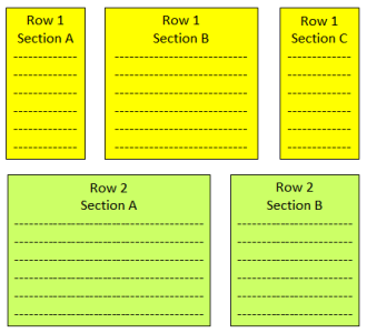
This is how side-by-side sections could be displayed on a wide screen:
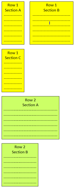
In a narrower window, the sections will begin to stack vertically, as shown below at left.
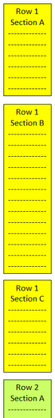
On a smartphone, all of the sections may stack vertically, as shown at right.
Note that the wider sections are resized to fit within the narrower width of the small screen, which can make the section taller.
Edit Wide
Due to this responsive behavior, it is best to layout your page on the widest screen you have available. This will allow you to see how your layout will appear for users
with large monitors. It will also make it easy to add sections side-by-side.
Think Sideways
Consider creating all of your sections on the same row, side-by-side. This will allow your page to adjust to any width screen.
If you take this approach, avoid adding sections above or below your current row. Use the  buttons directly to the left or right of existing sections to add new sections.
Then Narrow Your Perspective
Once you've laid out your page, test it on a narrow screen, like a smartphone. Or if you are working on a PC, make your browser window skinnier to see how it will look.
Width Affects Height
The Settings for each section let you control the maximum width of that section.
If you have sections side by side and one is much longer than the others, consider making it wider so that they line up better.
Or if you have one section that is much shorter than its neighbors, try making it narrower by reducing the maximum width.
 Color Adds Interest
Each section can be assigned its own background color. It can also have a border and shadow.
Play around with these options to come up with a pleasing design.
If you choose a dark background color, use light colored fonts to make your text stand out.
Going It Alone
Advanced web developers may wish to create pages with only one section so they can design the entire page using their own web design tools.
You can then paste your code into the page using the "Source" button for that section. You'll probably want to select the largest possible maximum width for this section,
and then control the width of your elements using the appropriate CSS tags.
Keep in mind that the Bootstrap libraries are automatically included with each page, so you can reference any of the Bootstrap classes.
You can also create additional classes in your own custom CSS and reference those classes from your pages.
If you wish to create your own responsive sections, use the following code to begin a new row that contains multiple sections:
<div class="new-row">
<div class="container-fluid container-flex">
Each section should then be defined by a <div>, which can be styled as appropriate.
Obviously, you'll need two </div> tags at the end of each row to close out the tags shown above.