As we just saw, the Main Menu gives you access to all of the functions you are authorized for.
This can be a bit overwhelming, especially when you're just getting started.
That's why we created hubs!
Hubs give you access to everything you need to manage a functional area of the site.
We currently offer these hubs:
- Membership Hub lets you enter and view your membership roster, patrols, and crews. It also lets you manage training and leadership.
- Events Hub lets you manage your unit's calendar and access participation reports.
- Advancement Hub shows you where each scout is at with ranks, merit badges and awards. It lets you sign off on requirements and produce reports.
- Financial Hub gives you access to all money-related functions.
As an example, here is what your Financial Hub might look like:
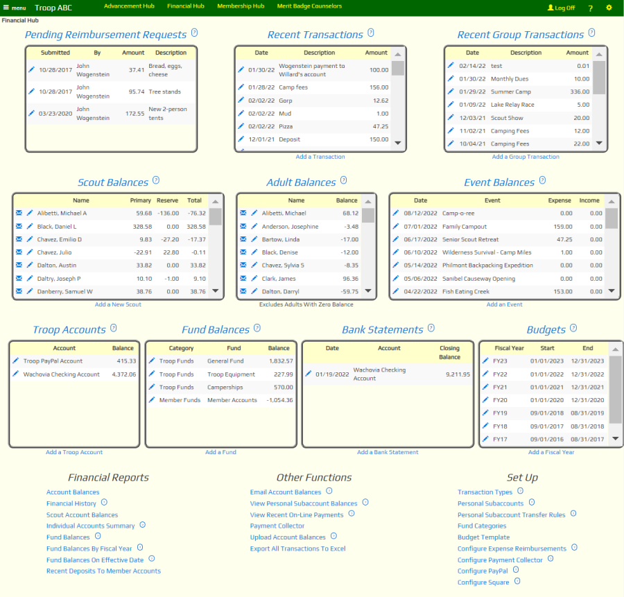
At the top of the page, you'll see a number of "Data Window" widgets that let you view the information in this part of the site from different perspectives.
The heading of each data window is a link to a corresponding page that shows you more information and lets you access more functions.
Many of the data windows have a link at the bottom that lets you add a row to that table.
Most data windows also have edit links - like this  - that let you enter information about that row.
Some data windows have a message link - like this  - that let you initiate an email to that person or group.
Further down the page, you will see several "Menu" widgets. These take you to the rest of the functions for this part of the site.
Once you're on a hub, you won't need to use the Main Menu to use this part of the system.
Everything is right here on the page!
Editing Your Hub
Earlier we said that this is what the Financial Hub might look like. Why did we say "might"?
It turns out that you can customize any hub to fit the needs of your unit. The changes you make to a hub will be available to
any member of your troop who is authorized for that hub.
Only those users who are authorized for the User Role of Web Page Editor are allowed to edit hubs.
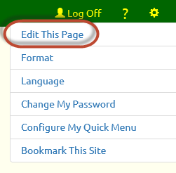 To begin, open a hub page and click the
 icon in the upper right
corner of the page to reveal the Tools menu, as shown at right.
icon in the upper right
corner of the page to reveal the Tools menu, as shown at right.
Click on "Edit This Page" at the top of the Tools menu.
Once you are done editing the page, go back to the Tools menu. The top item will now be "Exit Page Edit".
Page Sections
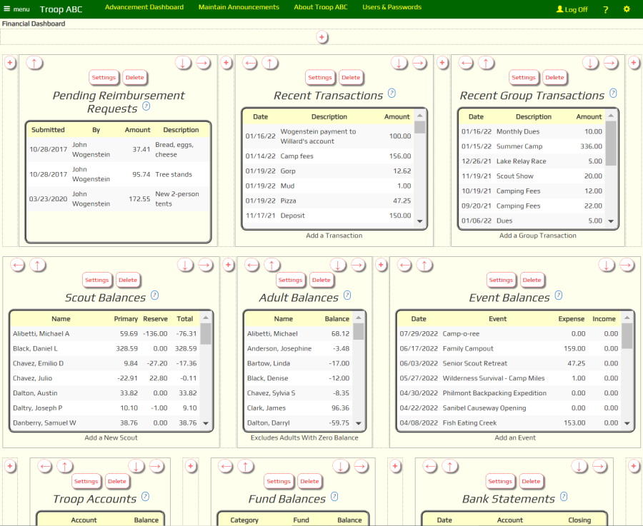
When you enter edit mode, you'll see the page divided into sections, as shown above.
A section is typically linked to a "widget", which is pre-programmed to pull information from your database or display a menu.
You can delete sections, move them around, or add new ones. You can even add sections with text and images that you provide, similar to what you can
do when you edit your Home page.
Rearranging The Page
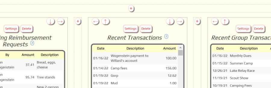
If you look more closely at the top of any section while you are in edit mode, you will see arrows in the upper corners.
These arrows can be used to change the position of this section relative to the other sections on the page.
When editing a hub, it is best to only use the Left and Right arrows.
Click the Left arrow to immediately swap positions with the section to its left.
Click the Right arrow to immediately swap positions with the section to its right.
The Up and Down arrows will move that section into a higher or lower row.
We don't recommend this, because it will prevent the page from arranging itself to fit the size of your monitor.
The hubs are designed to be "responsive", which means that on a wide monitor the sections will arrange themselves
across the page before beginning a new row. On a narrow screen, like a cell phone, these same sections will stack vertically.
The best way to see this effect is to display the page full screen on a wide computer monitor, then resize the browser window to make it narrower.
As the window gets narrower, you will see the sections rearrange to fit that width and, at the same time, make the page longer from top to bottom.
Adding A Section
For the same reason, when you add a section, you should usually add it to the left or right of an existing section by clicking the
 button you see to the left or right of that section.
In most cases you should not click the button that is above
or below the current section, as that will cause it to create a new row.
button you see to the left or right of that section.
In most cases you should not click the button that is above
or below the current section, as that will cause it to create a new row.
When you click the icon, the system will display this pop-up window with the settings for your new section.
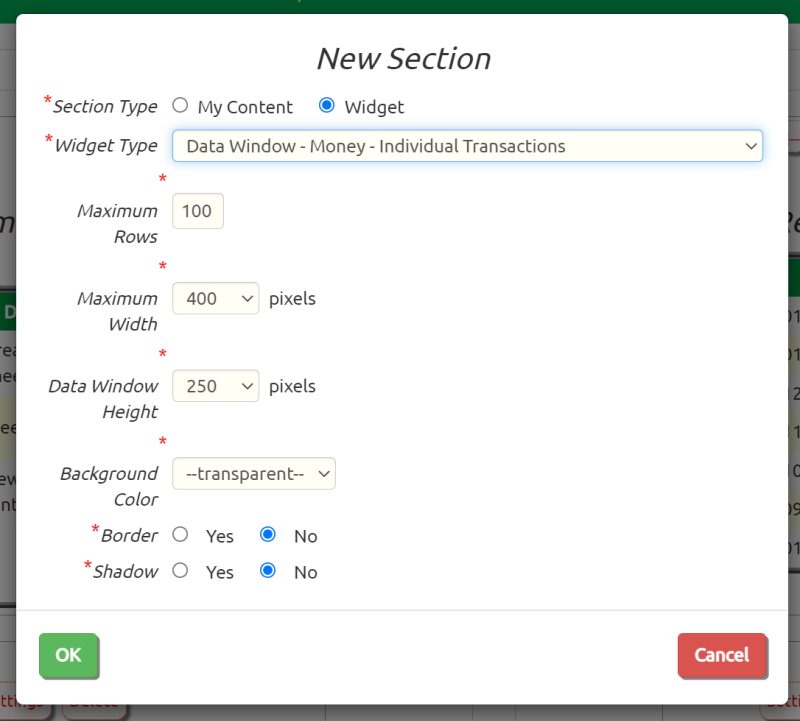
Choose between "My Content" which will allow you to enter text and images, or "Widget" which will fill the section with information from your database.
You can choose any widget from the list, even those that were designed for use with a different hub.
The choices you see on this page will change depending on the type of widget you select.
Data Window widgets and Menu widgets cannot be made available to the public. They are only available to users after they have logged on to the site, and then
only if that user has sufficient access rights.
The Maximum Rows option limits the number of rows that will be displayed in this widget. The fewer rows, the faster it will load.
The Maximum Width will default to an appropriate value for the type of section you've selected. For "My Content" sections, this can be used to adjust the
height of the section.
The Data Window Height determines how tall a scrollable Data Window grid will be.
The default Background Color is "transparent", but you can change this to any color you want. The drop down list gives you some standard choices,
but if you select "Other" you'll have the opportunity to enter any RGB color you'd like. On most browsers you should see a color picker.
Border will draw a border around this section and Shadow will create a shadow effect behind this section.
Menu widgets have a slightly different set of options.
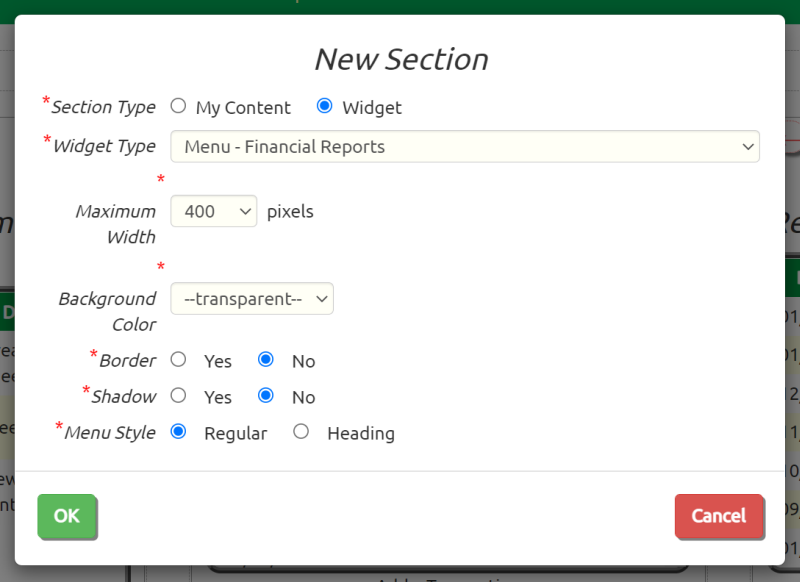
The standard Menu Style is "Regular", which will display a title at the top, followed by left-justified menu selections.
The "Heading" option is designed to display at the top of the page, with no title and all entries centered in the section.
Click the OK button when you are done. This will immediately save your changes to the server.
Updating A Section
Click the Settings button to change the parameters for an existing section.
You can even select a different widget!
Click the Delete button to remove this section from the page. A pop-up window will aks you to confirm this action.